Contents · 10

Stores often decide to redesign because the site “looks dated”. But what actually gets in shoppers’ way is rarely the button colour. It’s specific spots: search can’t find a product by SKU, filters reset themselves, the checkout form breaks on a phone. If you don’t find those spots before the redesign, the new site inherits the same problems in a nicer wrapper.
A UX audit answers one plain question: where and why do shoppers fail to place an order? Below is the order we follow when auditing an online store, and what we look at in each step.
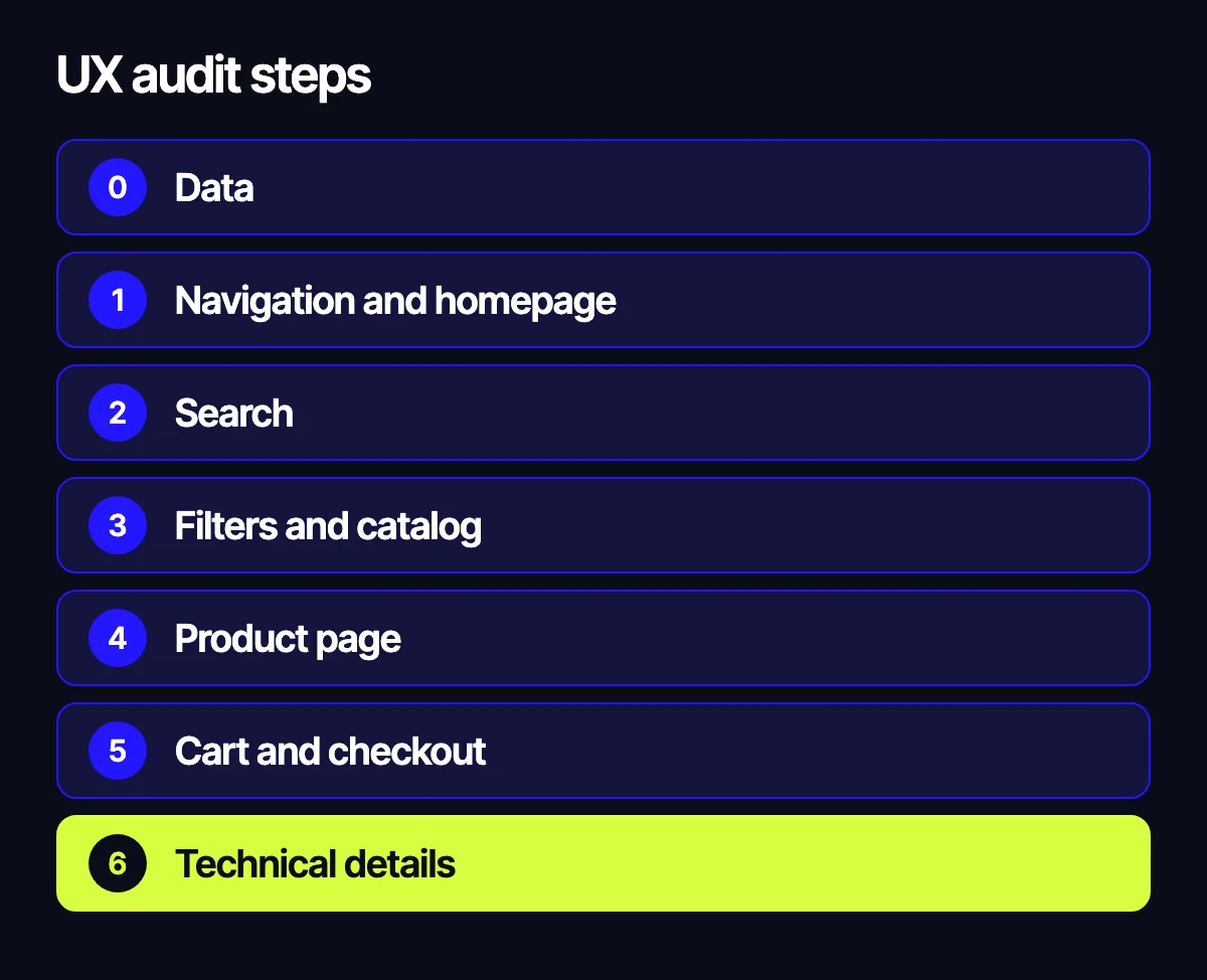
Step 0. Gather data before you look at screens
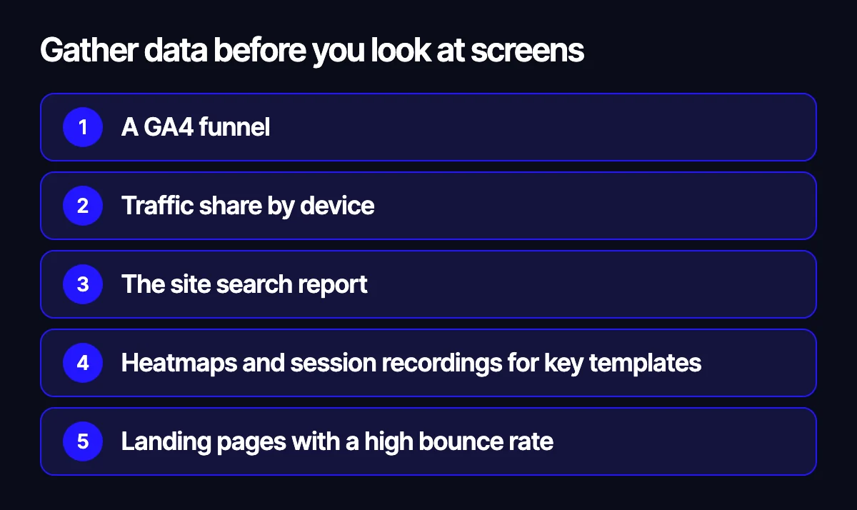
An audit done by eye turns into an argument about taste. So we start with numbers and behaviour:
- A GA4 funnel: landing, category, product page, cart, checkout, purchase. Split by mobile and desktop.
- Traffic share by device. If most visitors come from phones, the audit starts with the mobile version.
- The site search report: most frequent queries and queries with zero results.
- Heatmaps and session recordings for key templates: home, category, product, cart, checkout.
- Landing pages with a high bounce rate.
Step 1. Navigation and the home page
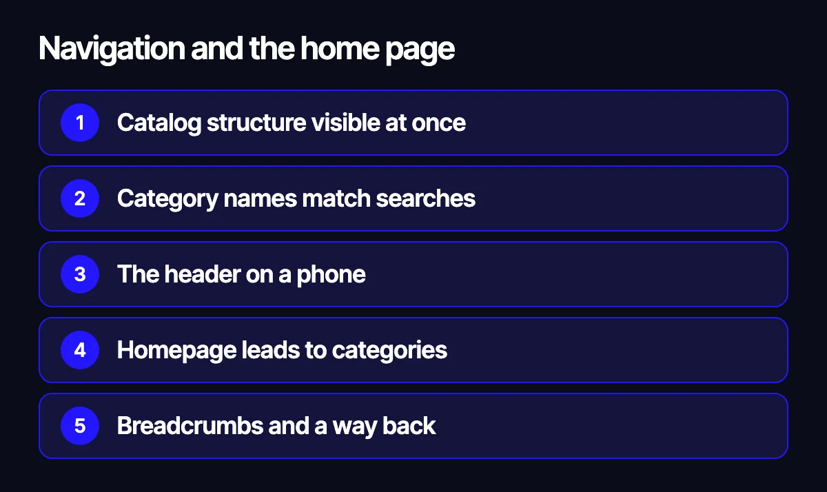
The home page and menu should take people to key categories in a couple of taps. We check:
- Whether the catalogue structure is visible right away or hidden behind a burger menu.
- Whether category names match the words shoppers actually use.
- How much of the mobile screen the header takes and what’s left above the fold.
- Whether the home page leads into main categories or shows a bit of everything.
- Whether there are breadcrumbs and a clear way back from a product to its category.
Step 2. Search
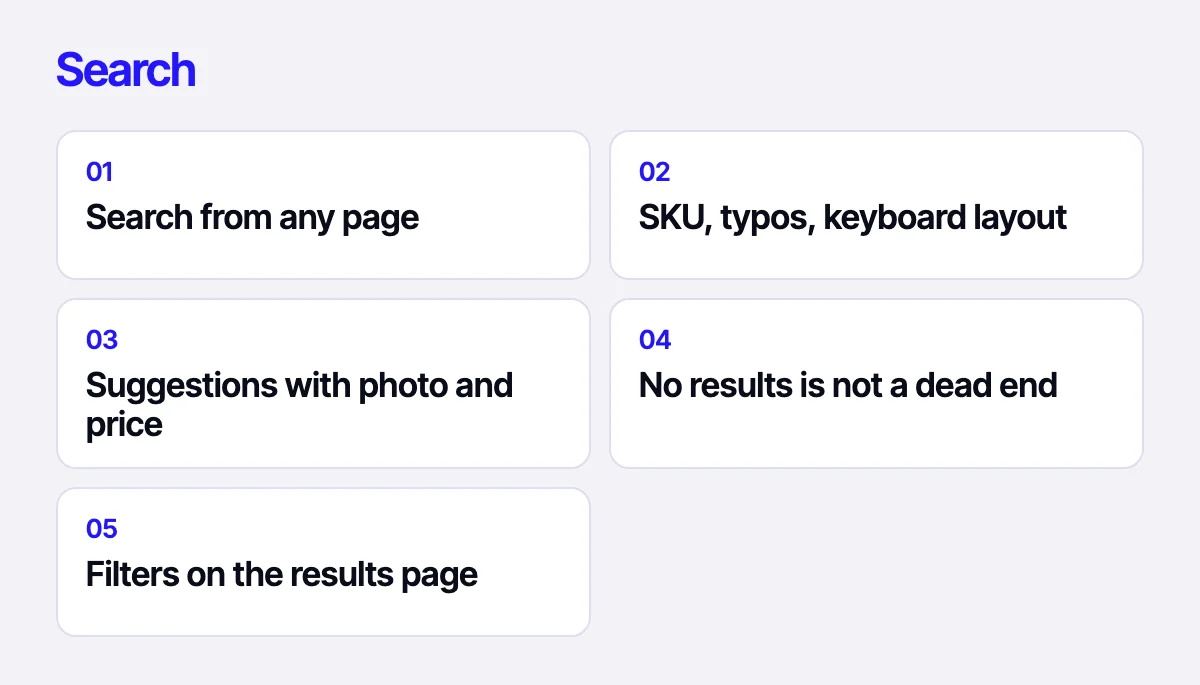
People who use search usually know what they want. They are your warmest visitors, and losing them hurts the most. We check:
- Whether search is one tap away on every page.
- Whether it finds products by SKU, brand and model, with typos, in a different keyboard layout or another language.
- Whether autocomplete shows suggestions with a photo and price.
- What a zero-results page offers: a dead end, or similar products and popular categories.
- Whether filters and sorting work on the results page.
Take the most frequent queries from the report plus the zero-result ones and run them by hand. It’s the fastest check in the whole audit.
Step 3. Filters and listings
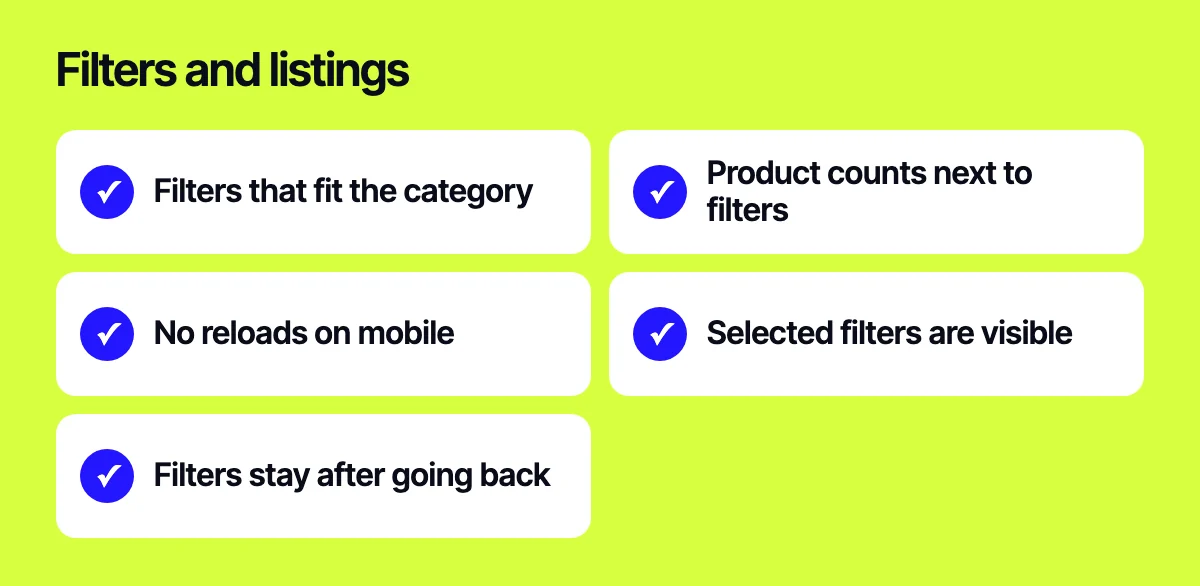
Filters decide whether a shopper finds anything in a category with hundreds of items. Typical issues:
- The same filter set for every category, although shoes need size and electronics need specs.
- No product count next to filter values, so people land on an empty page.
- On mobile, every filter tap reloads the page and closes the panel.
- Active filters aren’t shown above the list and are hard to remove one at a time.
- Filters reset after opening a product and going back.
We also look at product tiles in listings. The photo, name, price and any saving should be easy to read. Anything that intercepts taps gets in the way.
Step 4. Product page
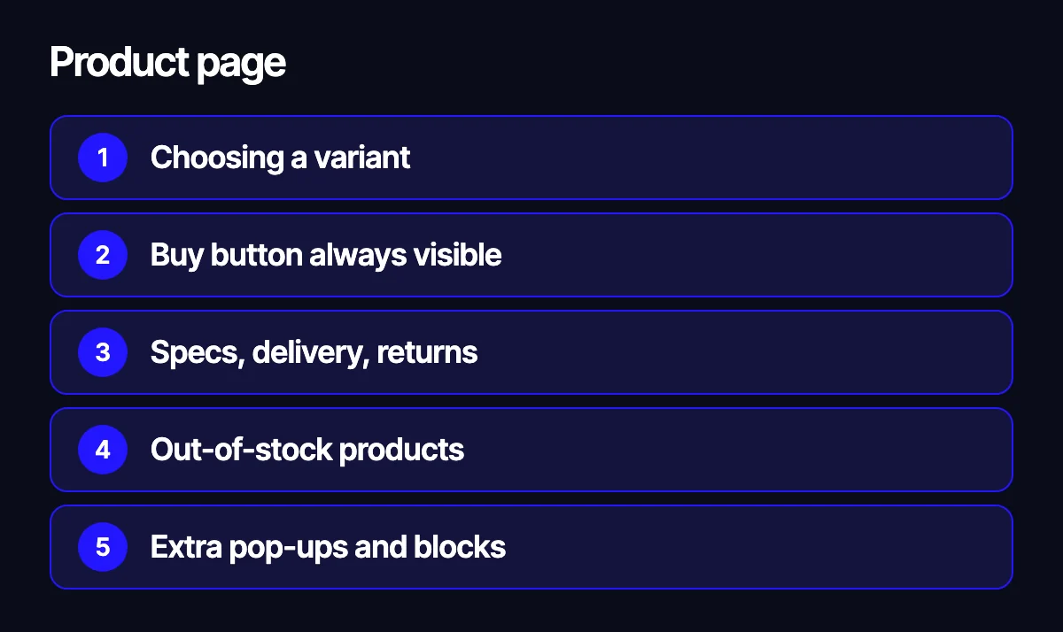
Here we check whether someone can decide without scrolling through half the page:
- How a variant (colour, size, flavour) is chosen and whether it’s clear what must be selected.
- Whether the buy button stays visible.
- Where key specs, delivery and returns information sit.
- What happens when an item is out of stock.
- Whether pop-ups or rarely used blocks distract from buying.
Step 5. Cart and checkout
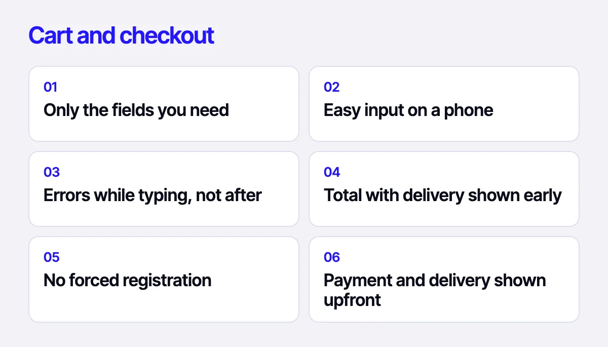
Checkout is where a shopper who has already decided can still walk away. We go through it ourselves on a phone, with real data, and watch session recordings:
- How many fields the form has and which of them delivery actually needs.
- Whether input is comfortable on mobile: the right keyboard types, input masks, address autocomplete.
- When errors appear: while typing or only after pressing the button.
- Whether the total including shipping is visible before the last step.
- Whether registration is mandatory.
- Which payment and delivery options exist and whether they’re shown early: Stripe, PayPal, DHL or local carriers.
Step 6. Technical details that feel like UX
Slow loading, layout that jumps around, buttons that are hard to hit with a thumb: users experience all of this as a clumsy site. We check the speed of key templates, tap target sizes, behaviour on narrow screens, and how forms cope with a poor connection.
Common mistakes in the audit itself
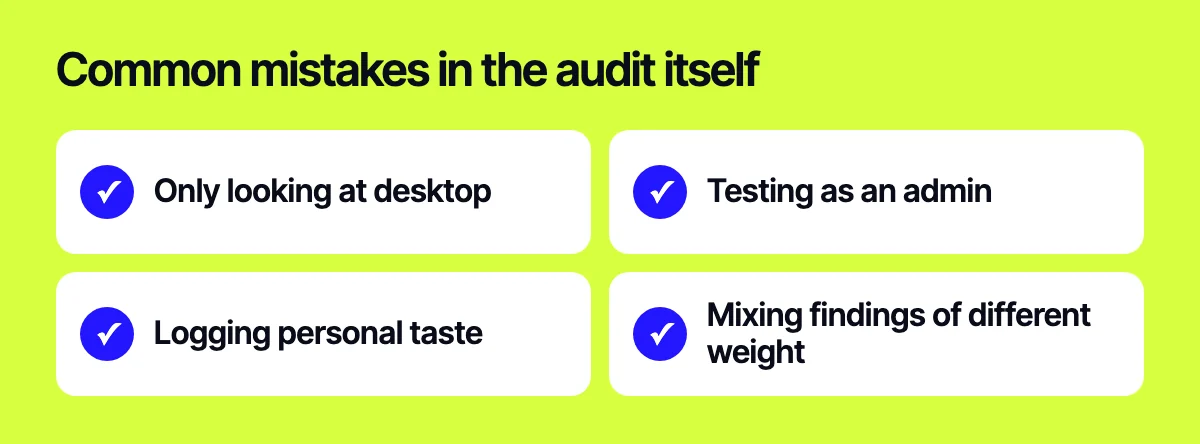
An audit can be done badly too. Here’s what we try to avoid:
- Reviewing only desktop because screenshots are easier to take there, while shoppers are on their phones.
- Testing the site while logged in as admin or with an ad blocker on. Real shoppers see different pop-ups, banners and load times.
- Listing everything you personally dislike as a problem. Every finding should rest on data or a recording of a real session.
- Mixing findings of different weight. A typo in the footer and a broken payment step shouldn’t sit in the same list without priorities.
What you get at the end
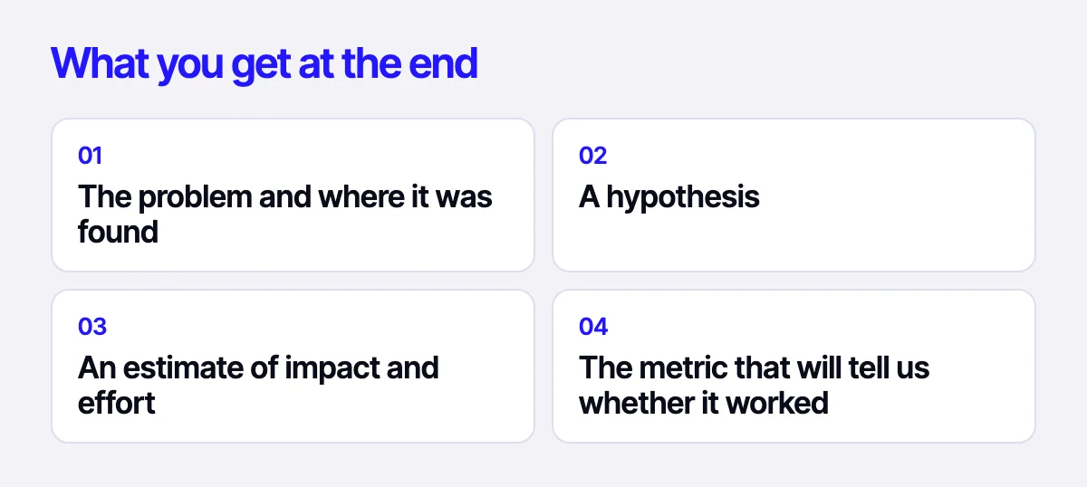
The audit result isn’t a slide deck full of screenshots. It’s a working list:
- The problem and where it was found: screen, data, session recording.
- A hypothesis: what to change and why it should help.
- An estimate of impact and effort.
- The metric that will tell us whether it worked.
Quite often this list shows that a full redesign isn’t needed.
If a redesign is needed after all, the audit becomes its brief. The designer works from concrete problems to solve rather than a wish list.
Related reading: 12 places where an online store loses buyers; how to migrate a site without losing rankings.
Get your store audited
Describe your task and send a link to your store through the form on the site, on Telegram, WhatsApp or by e-mail. We’ll review your analytics and key screens and tell you where to start: targeted fixes or a redesign.
Leave your contact – we'll reply within one business day wherever suits you.