Contents · 5

A shopper who opens a product page has nearly made up their mind. What loses them from there is rarely price or competition. It is the small stuff: the buy button scrolls out of view, a variant is hard to pick on a phone, the checkout form rejects a perfectly normal surname. Each of these costs you orders, and none of them shows up in a standard report.
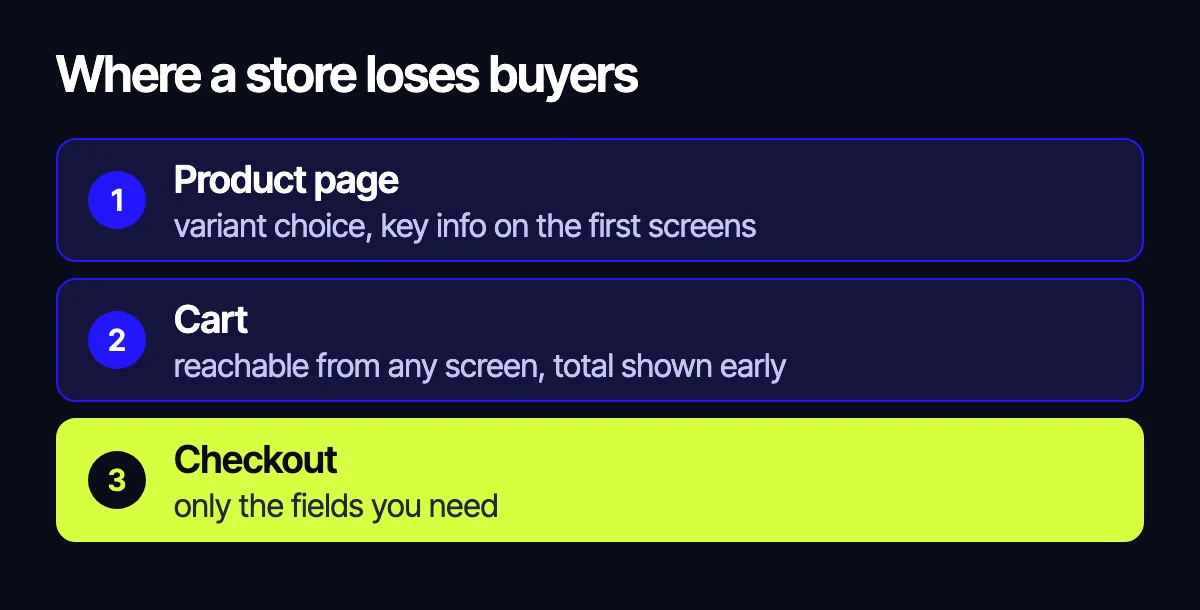
Below are the 12 spots we check first when we take on a store for conversion work. They are grouped into three areas: product page, cart and checkout. Where we have numbers from our own projects, we share them. Where we don’t, we explain how to test the point yourself.
Product page
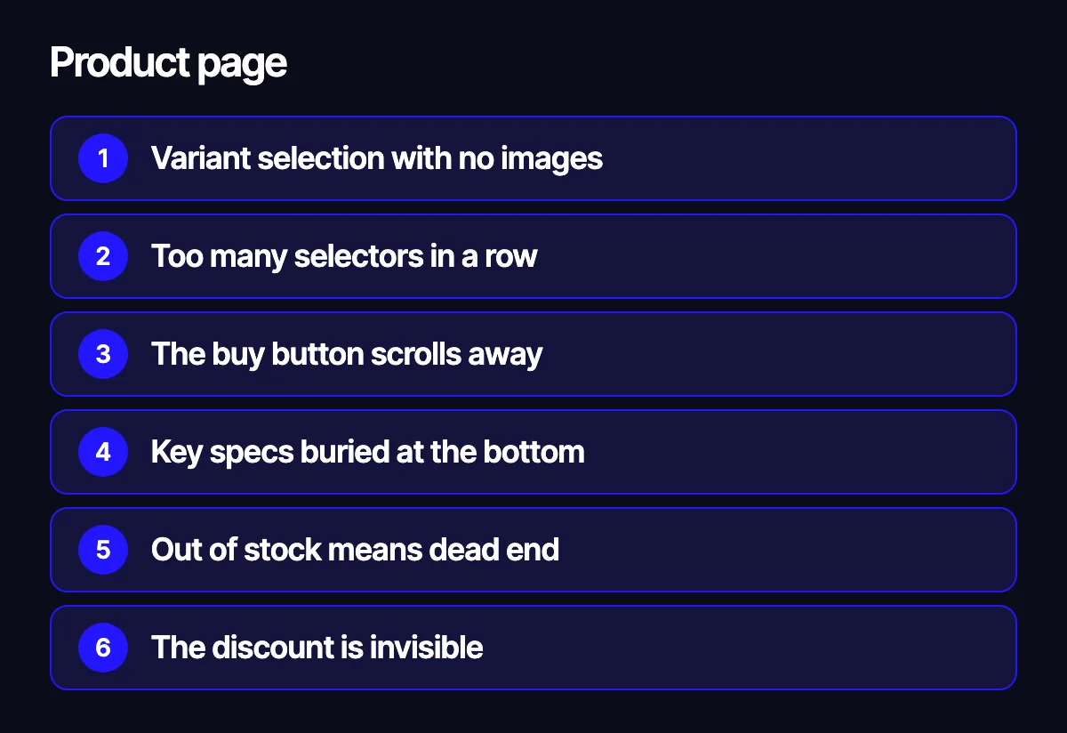
The product page is where the decision happens. On mobile it tends to be long, so everything that matters has to fit into the first couple of screens.
1. Variant selection with no images
Colour, size, flavour or volume is often picked from a plain dropdown. With many options, that turns into scrolling through a text list on a small screen. The shopper isn’t sure they picked the right one and leaves to think about it.
What to do: show variants as chips with a photo and a name, in a single swipeable row, and open the full list in a bottom sheet with search.
2. Too many selectors in a row
Three or four dropdowns stacked on top of each other, and no clear sign which ones are required. While the shopper figures it out, they are not pressing Buy.
What to do: keep it to two choices at most. One visual (colour, flavour, print) and one technical (size, volume, power) shown as segmented buttons. Show unavailable options crossed out instead of hiding them.
3. The buy button scrolls away
The shopper swipes through photos and reads the description, while Add to cart sits far above.
What to do: add a sticky bar at the bottom of the screen with the price, the buy button and a wishlist icon. It appears once the main button leaves the viewport.
4. Key specs buried at the bottom
If size, material or compatibility drives the decision and it sits at the very end of the page, many shoppers never find it.
What to do: pull the three or four most important specs up under the product name as chips with icons. Keep the full table further down and link to it.
5. Out of stock means dead end
A page with a grey Out of stock button is the quickest way out of your store, even though the visitor came ready to buy.
What to do: replace the button with Notify me when available and show similar in-stock items next to it.
6. The discount is invisible
There is a sale, but it’s printed small and grey, or only shows up in the cart. Shoppers don’t register it.
What to do: put a clear discount badge with the amount saved on the product photo and on product tiles in listings, search and promo pages.
7. Related products are too far away
The Frequently bought together block sits at the bottom, where few people scroll. Compatible accessories and consumables go unnoticed.
What to do: place related items right next to the selection point, as a compact row with a + button.
Cart
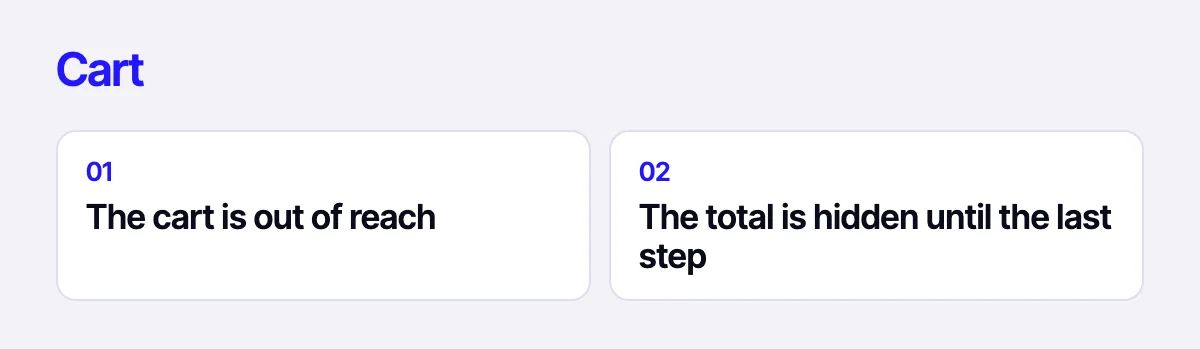
8. The cart is out of reach
On mobile, the cart icon usually lives in the top right corner, where a thumb can’t reach. The shopper adds an item and isn’t sure how to move on.
What to do: add a bottom navigation bar with home, catalogue, search, wishlist and cart.
9. The final total is a mystery until the last step
Shipping, fees or a minimum order value only appear at the very end. That’s an unpleasant surprise, and the tab gets closed.
What to do: show an estimated shipping cost in the cart, list available delivery and payment options, and show how much is left until free shipping if you offer it. If you ship with DHL or take payments through Stripe or PayPal, put the logos and terms here already.
Checkout
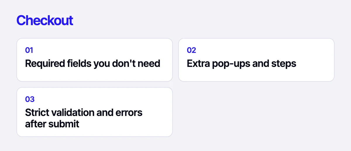
Checkout is the most expensive place to get things wrong, because the shopper has already decided to buy. Here we don’t redraw the whole form. We remove barriers one at a time.
10. Required fields you don’t need
Every field that isn’t needed to deliver the order lowers the chance of finishing. Fields that are awkward to fill on a phone hurt the most.
What to check on your side: which fields your fulfilment team and ERP actually use. Everything else can go or become optional.
11. Extra pop-ups and steps
A separate pop-up for a messenger handle, forced registration, a jump to another page for a single field. Each extra step is another chance to leave.
What to do: keep everything in one form.
12. Strict validation and errors after submit
Surname must be one word in one alphabet, phone number must match one exact format. Errors only show up after pressing the button, and it’s unclear what to fix.
What to do: validate as the user types, explain the error in plain words next to the field, and accept double-barrelled names and Latin characters.
How to test these 12 points on your store
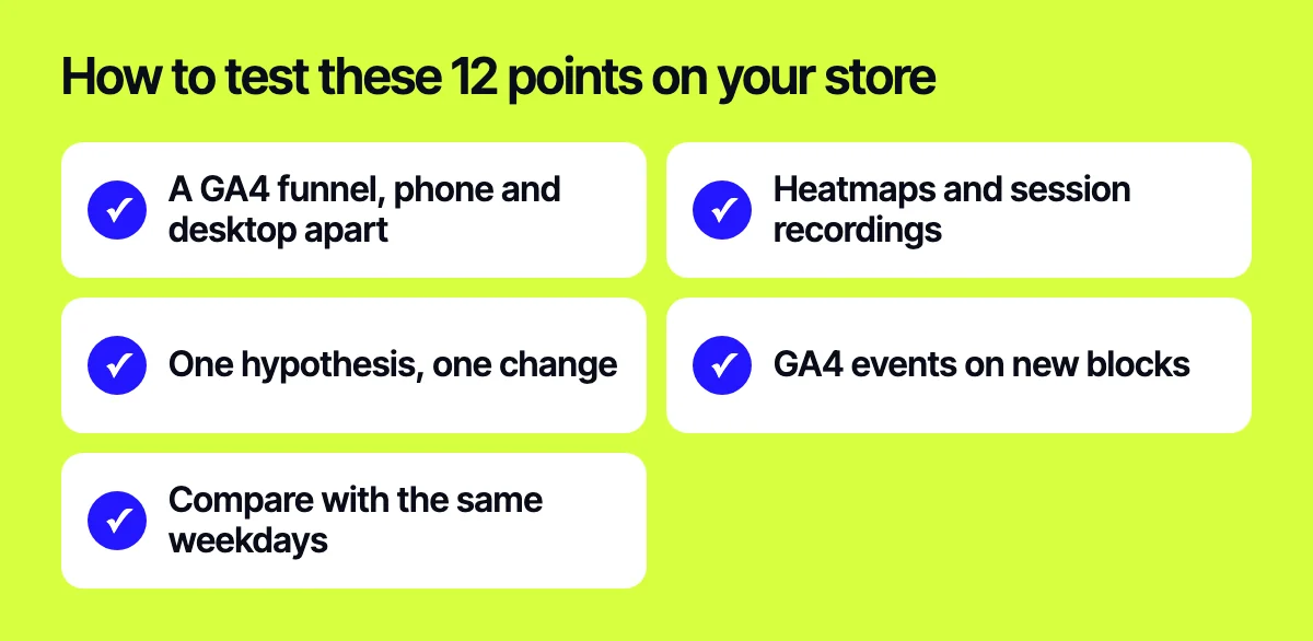
A checklist only helps when you hold it up against your data. Here is how we usually go about it:
- Build a funnel in GA4: product page, add to cart, begin checkout, purchase. Look at mobile and desktop separately.
- Watch heatmaps and session recordings for the step with the biggest drop. Look for missed taps, long pauses and back-and-forth movement.
- Write a hypothesis for each problem and ship changes one by one on a staging copy, with a quick rollback option.
- Tag new page elements with GA4 events so you can measure each one separately.
- Compare the period after launch with the same weekdays before it. That reduces the noise from seasonality and day-of-week effects.
You don’t need to fix everything at once. Start where the heatmap shows the most obvious problem.
Related reading: what to check in a UX audit before a redesign; 17 ways to increase an online store’s conversion rate; how website speed affects sales.
Let’s look at your store
If you want to know where your store is losing shoppers, send us your task through the form on the site, on Telegram, WhatsApp or by e-mail. We will review your analytics, heatmaps and key screens and come back with a prioritised list of changes.
Leave your contact – we'll reply within one business day wherever suits you.